SERVING FAMILIES ON THE MAINLINE
Budgeting for Renovation
I recently held a giveaway for my Instagram followers. The prize was a gift card in exchange for correctly guessing the budget for our recent kitchen renovation. This was partially a tactic to engage with my followers, but also a way to gauge what people thought the renovation may have costed. I was shocked to find out that guesses were upwards of $5,000.
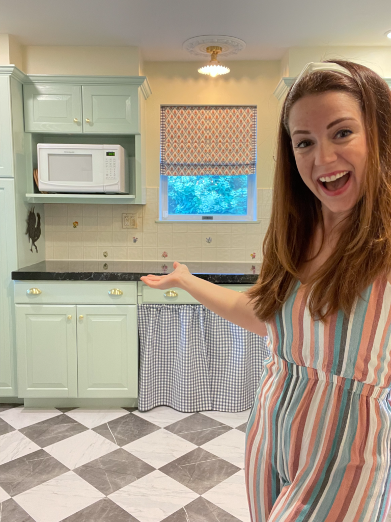
The reason our kitchen was renovated on such a tight budget is because within the next 2-3 years, the kitchen is actually going to move across our house into a location that flows better without layout, so we did not want to spend a lot of money on it now – we just wanted to make it a more enjoyable space for us to live and function in daily.
Our kitchen renovation costed us $1,000! Finding that others saw more value in our renovation than that made me feel like all of our hard work was worth it. Hopefully it is a motivator for others to put a little TLC into their own homes. But now that the question of cost has been answered, that leaves us with the question of HOW? Don’t’ worry, I’m here to tell you..
The first thing I knew I NEEDED for our kitchen was Chris Loves Julia’s new line of stick-on tile floor tile from their collaboration with Wallpops. That was really the game changer here, because Wallpops business model is to provide an easy renovation tool at a really affordable price. So, we were able to completely transform our flooring for $2.09/Sq. Ft. bringing our total to $251 for our flooring – I mean, this is unreal.
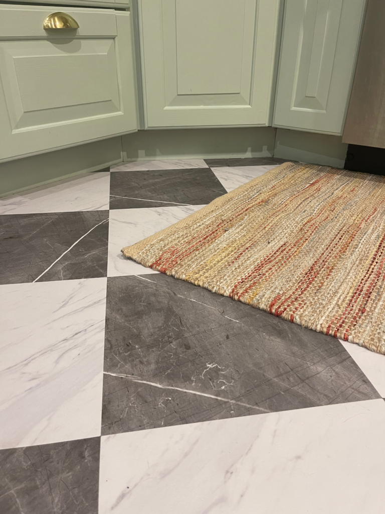
I knew I wanted to paint our kitchen cabinets, but I really couldn’t decide on a direction. I can be really indecisive at times, and this was one of those times. I tried to select a wallpaper first, so I could pull a color from the wallpaper, but then I decided not to wallpaper since the renovation is temporary (but I think I changed my mind back, so stay tuned for a possible surprise). That left me with no guidance on colors, so I really just selected a color at random. I went with Slow Green by Sherwin Williams and for the walls I chose a soft white, since there was so little wall space in the kitchen – I wanted to keep it light and bright. So, the walls are painted Summer White by Sherwin Williams. The total cost of paint was $120, including ceiling paint.
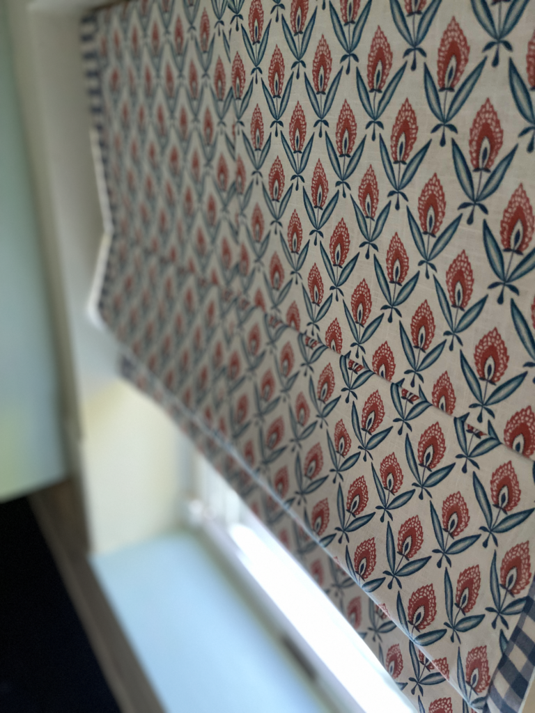
Next, I knew I wanted to try and tackle a roman shade on my own, so I needed to select a bold fabric that would jump out against the slow green. I also knew that I definitely wanted blue gingham worked into this design. I was looking for quality fabric at an affordable price, so I ordered a million samples from Fabricut. They have a new collection called French General, which I immediately fell in love with, so I was pretty sure I’d be selecting a print from the French General line. I went with the Darcy print in the Jardin color for the roman shades, the blue gingham in French Blue for the café curtain, and Kornack in Blue Coral for the ruffle on our Dutch door. Everything I needed for the window treatments came to $198.
I hadn’t originally planned to do anything to our countertops, but once the cabinets were painted, it felt urgent to add contrast to room. I painted the countertops black, I added faux marble veining, and coated them with a clear resin. This entire process can be purchased in a kit by Stone Coat Countertops on Amazon for $109. We actually did not have to spend that because we still had enough resin left over from the custom table we built earlier in the year. I’m glad we did this, because I feel it makes the kitchen.
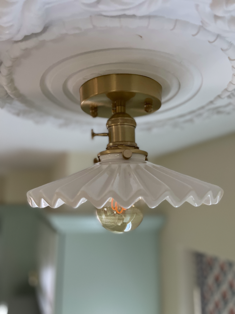
I wasn’t sure what to do with the lighting because we already had a bunch of high hats in the kitchen and they were installed rather haphazardly without any regard to placement, so doing anything major would have been tedious, especially because our ceiling is pitched by about 1.5”. So, I decided I wanted the two high hats over the windows replaced with flush mounts to add some detail and elegance to the space. I found these lights on Amazon and immediately fell in love. They were $162 altogether.
Our cabinet hardware obviously needed to be replaced to tie it all together, and luckily, I was able to find that on Amazon as well. I purchased one large pack of knobs and one large pack of cup handles, and the total came to $69 for all of it.
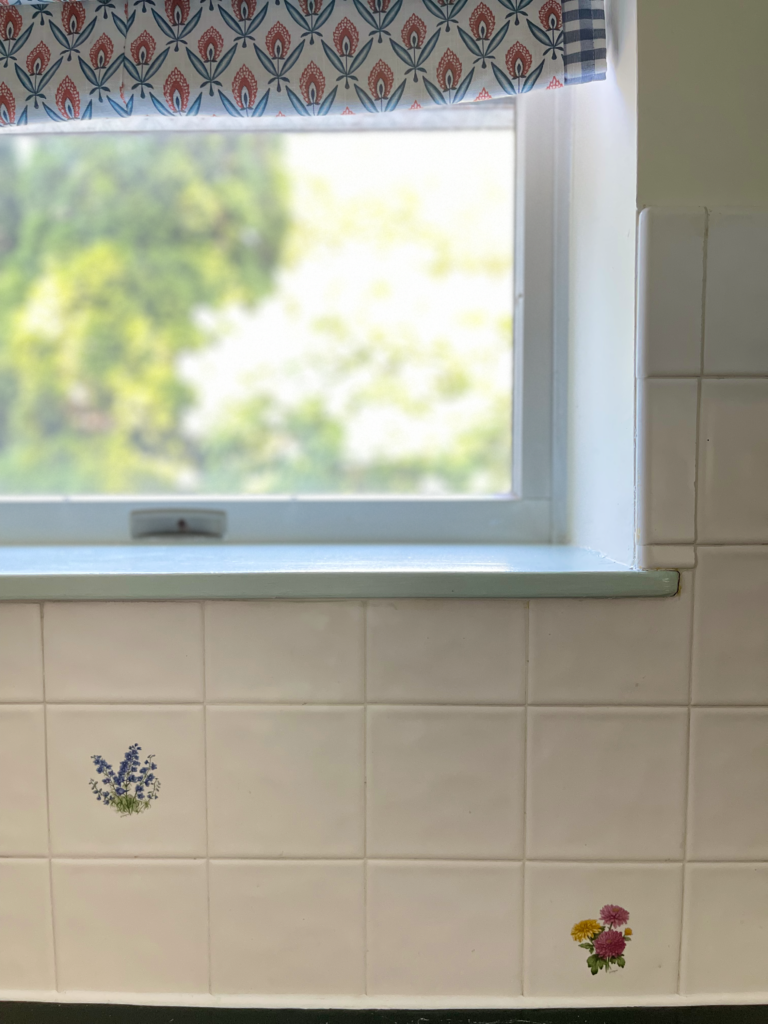
I had originally purchased stick-on backsplash to cover our old backsplash. Because I knew this, I wasn’t as careful as I could have been when painting and pouring resin over our countertop. However, once JJ began installing our new backsplash, I missed our old one. I feel like it has a cute old farmhouse charm to it, and I like that it was a part of the original house. So, he removed the stick on and had to scrape and clean the original backsplash free of resin and paint, which he was thankfully able to do, because I love how it looks with all of my new selections. The people who lived in our house before us (the original and only owners) chose that backsplash, and I just felt attached to it. Their names were Charles and Susie, and there is a lot of interesting story surrounding them, I will go into detail on them in another post.
Lastly, all I had to do was choose artwork and an area rug, and where better to do that than my trusty Target? The area rug was $35 and the cow sketch prints were $35 for the set. All of the other artwork, I already owned and repurposed for the space.
So here you have it:
Flooring: $251
Paint: $120
Fabric: $198
Resin Kit: $109
Lighting: $162
Hardware: $69
Artwork: $70
Total: $979
If money is holding you up in your design process, don’t let it! There are enough options out there for those of us who are on a budget – you just have to know where to look! Lucky for you, I am here to provide that for you. Don’t hesitate to reach out to me on Instagram @l.ttlegreenhouse for design advice, consulting, design, or tips and tricks for DIY and budgeted reno.
Leave a Reply Cancel reply
design diary
contact
home
portfolio
©2025 little green house interior co | site credit Karima Creative | copy credit black diamond copy co